When it comes to online shopping, almost 70% of users abandon their carts—and this figure is even higher when it comes to mobile users.
Baymard Institute’s survey has identified a few key reasons for this:
- Extra costs too high
- Account is required
- Checkout is too long
- Unclear pricing
- Don’t trust the site
While a couple of these are simply necessities of the ecommerce experience, we believe that the majority might be solved by a clear and effective cart page.
The cart page is an essential part of an eCommerce website as it allows customers to review their selected products before finalising their purchase. However, the cart page is often overlooked when it comes to website design and optimisation. In this article, we will discuss several ways to improve the cart page on an eCommerce website to provide a better user experience and increase conversions.
With any online store, you have two ways of directing the customer based on their intention to add something to the cart.
First, if you offer it, they can click “dynamic checkout,” which will bypass the cart. This is great if you don’t want them to build a basket, see a total, or upsell. We usually enable the dynamic checkout when we notice people are buying single items and have a low average cart value, as it will convert better.
Otherwise, your customer will be directed via the cart, to review their list of items, see their total, and the number of discounts, before reaching checkout.
Why direct to cart?
The main advantage of directing to the cart is that it is your final interaction with a customer before they decide to buy. You can show savings, discounts, reviews, upsells, and trust signals—all of which are important in giving the customer confidence.
Keep the experience consistent
Keep your cart consistent. After a customer has decided to make a purchase, you want to ensure that their journey to completing the transaction is as seamless as possible.
Even the smallest of changes between your store and checkout can be jarring to customers. Whether it’s a different colour scheme or the use of different fonts, any sense of discontinuity interrupts the customer and risks them getting distracted or changing their mind.
There’s also no reason why you’d give your Shopify cart a different design aesthetic, so to maximise your conversions, keep it as consistent as you can.
Cart Checklist
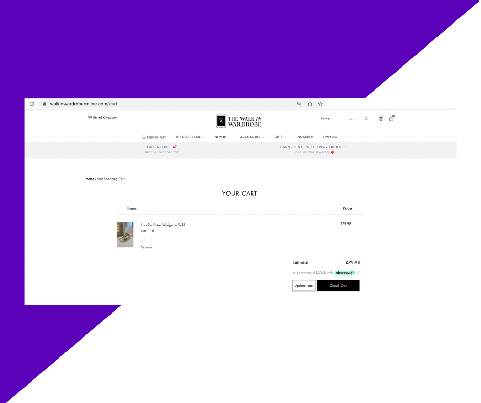
1. A clear title to show what page they are on
With any and all web pages, you should aim for clarity as a staple. That means adding a clear, concise title to each page, including your shop cart. This simply alleviates any confusion a customer may find on their journey from store front to cart checkout, and allows them to reorientate themselves if they have been working on another tab or browser.
You can see here, with our client Walk in Wardrobe, that the page title and URL both reflect that the customer is on the cart page. This is also visible in the browser tab.
2. Bring in trust signals above the fold
Wikpedia defines trust signals as “evidence points that appear online to help customers feel more secure in their decision to purchase from a business or buy a product or service”. In even more basic terms, a trust signal is a reminder of your product and brand’s trustworthiness, and it’s an especially important element of these last steps of the purchasing process.
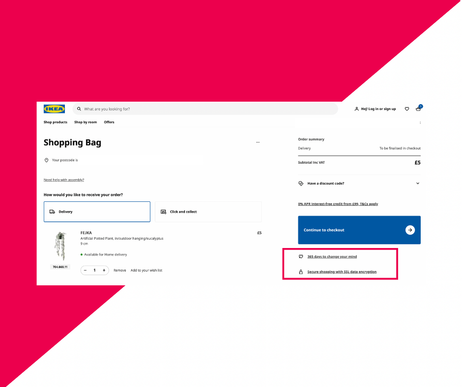
As an example, we can look to IKEA’s shop cart page. It includes trust signals below the very prominent Continue To Checkout button: “365 days to change your mind” and “Secure shopping with SSL data encryption”. This communicates to customers that they are both safe to shop here, and have the option of returning items, too—a big encouragement to finalise this transaction.
Other trust signals might be “Over 300 Reviews”, “Free Returns”, or similar.
Note here, too, that these trust signals are above the fold—that is to say, placed above a position on the page where a user would have to scroll. You want your customers to see these signals without having to search for them, so display them loud and proud as IKEA has done.
Make sure you allow the customer to easily change the quantity or size of an item
Customers don’t want to have to return to the shopping page in order to add on another item—they want to edit and change things right there at the cart page, no clicking about required. This is especially useful when you carry products which might be purchased as gifts or in high quantities.
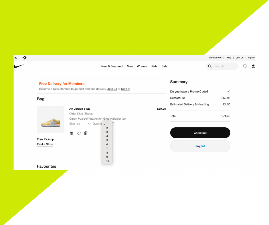
Check out Nike’s cart page for an example of this. You can see the product you’re buying, and a couple of dropdowns—sizing and quantity. By clicking this, a user can easily change the product quantity from 1 to 10. They can also correct this from, for example, 2 back to 1, if they have accidentally clicked on the “add to cart” button twice while on the shopping page. The same can be said about the sizing—they can update this if there has been a mistake, or simply want a different size now that they’ve reached the cart.
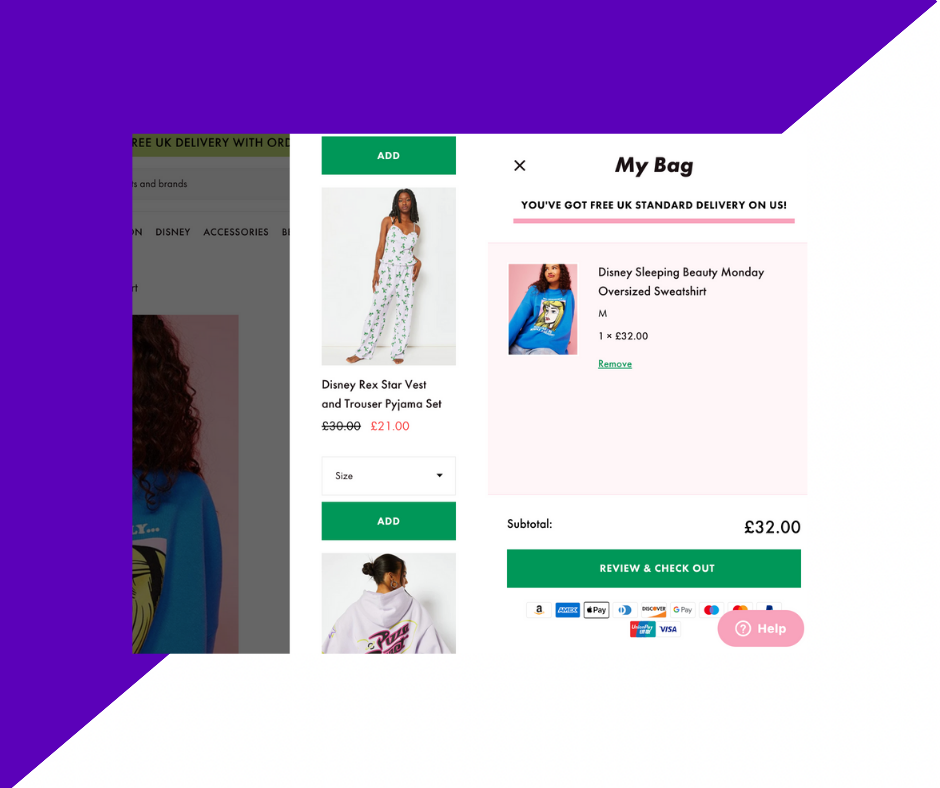
Make sure you let them remove an item from their cart
Not only should your customers be able to edit their items—they should be able to remove them, as well. Many users add lots of products to their carts—particularly if you don’t have a wishlist or “favourites” feature to save products for later—with the intention of only buying a fraction of them. That means that when they get to the cart, they will want to weed out items they don’t want to purchase (at this moment, at least).
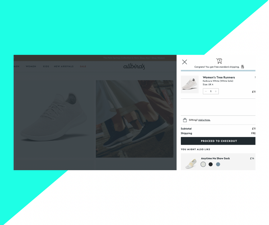
This can be as simple as allowing them to change the quantity of the item/product to 0. You can see how All Birds doesn’t show a “delete from cart” option, but simply offers functionality to reduce the item quantity to nothing, and prompt the removal.
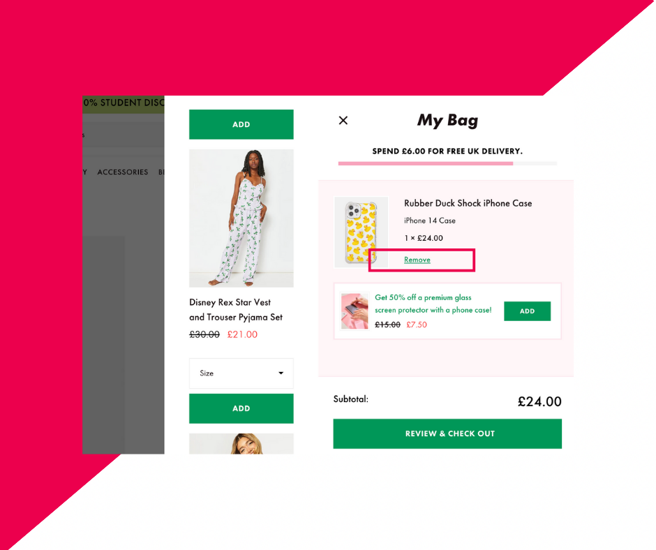
Alternatively, many brands offer “Remove from cart” or “Delete item” options, in line with the product. See here, Skinnydip’s cart includes a “Remove” button, which will simply and easily take the item, no matter its quantity, out of the cart.
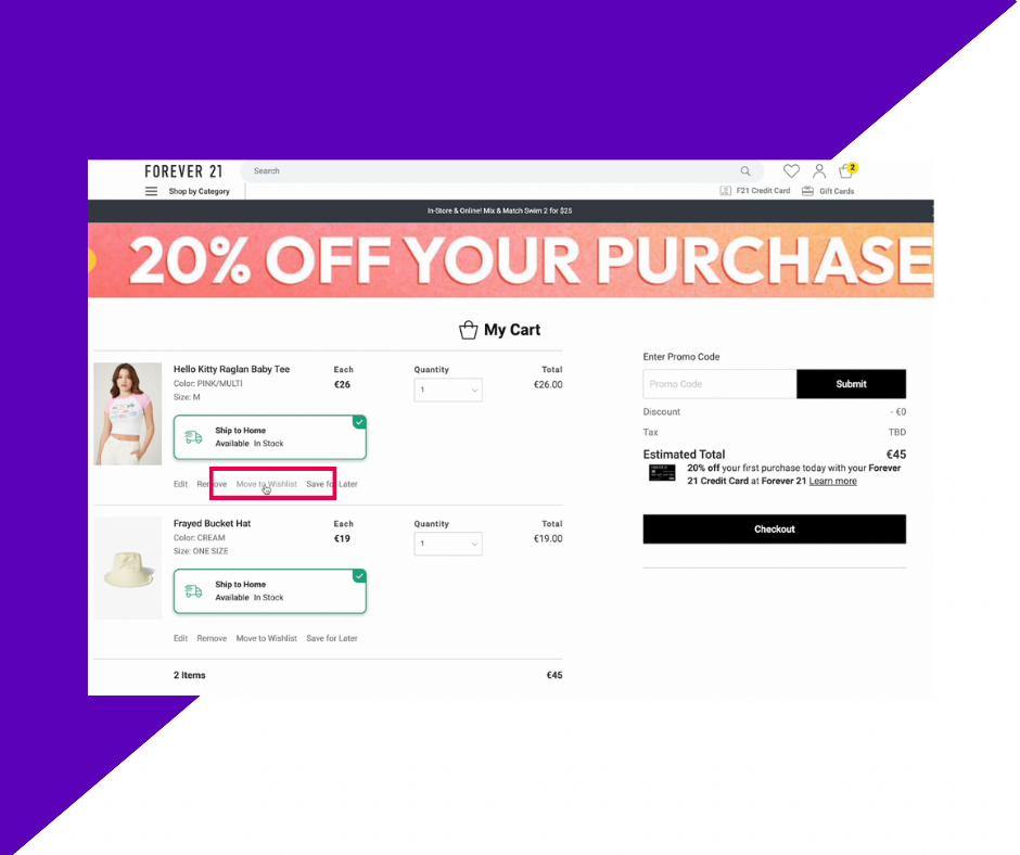
Forever 21 has an interesting addition to this, too. This fashion brand offers not just a “Remove” button, but the option for users to “Move to wishlist”. This removes the item from the cart but saves it to the user’s wishlist (if they have a Forever 21 account), allowing them to return to the item at a later date, without losing it in your overall product catalogue.
Allow them to add order notes
Order notes can be a really useful addition to your cart page. These fields allow customers to add specific instructions when placing their orders, such as more in-depth delivery guidance (e.g. “place in the greenhouse” or “third house on the street, red door”) or a request to send the package discreetly. It might even include a gift note, if the purchase is not for the user and being sent directly to friends or family.
It also alleviates the complication of a customer placing an order and then possibly contacting you via email or your chat system in order to communicate that additional information.
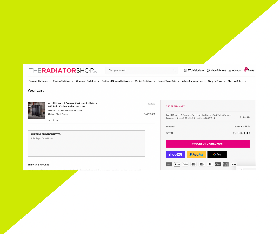
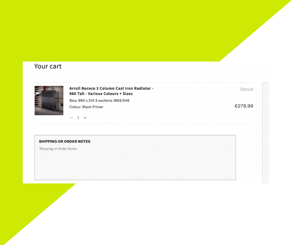
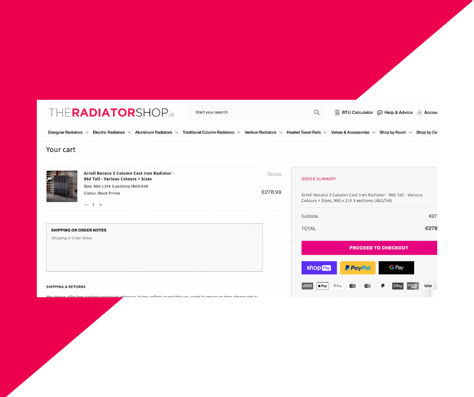
Our client The Radiator Shop offers their customers a large comment field to add “Shipping or Order Notes”.
Show payment options clearly
Do you offer various payment options, such as Paypal or Amazon Pay? Make sure to display these prominently so that your customers know all of their options before checking out. It can also be useful in the case of a customer having payment details saved on, for example, Paypal but not having a debit card to hand. They will then be able to check out via Paypal, rather than delaying their purchase until they have their card.
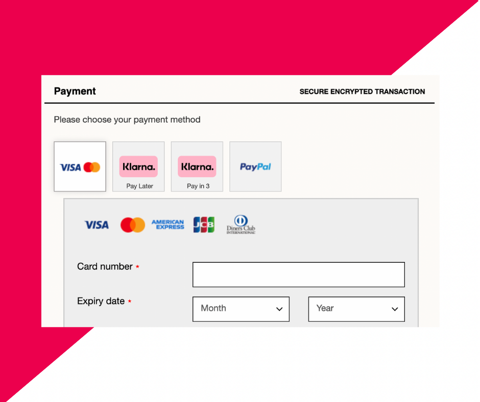
If you use Buy Now, Pay Later options, show these just as clearly. Buy Now, Pay Later functionality, such as Klarna, can be an especially beneficial feature for both your business and your customers, and you can see how with Rare Beauty’s checkout page (above), the page showcases all of their payment options with visual identifiers, plus Klarna’s Pay Later or Pay in Three options. This gives the customer all of the information at once in a simple, visual manner, and they can then easily and effectively assess their choices.
Clearly show the total (with savings)
No one wants to be surprised by a bill, and your customers should never checkout without being completely confident about the total they have spent. Display the total expenditure, including delivery and any VAT or tax additions. You can also add discounts and promotions into the calculation, to reveal the deduction from the total, if you have discount fields added as this stage and not checkout.
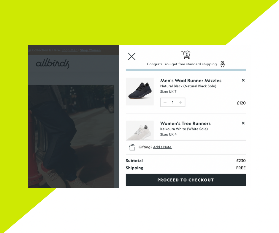
See here, on AllBird’s website, how the two products have added up to the subtotal and that the delivery is free—all clear cut and obvious to our shopper what they’re spending.
Clearly state if shipping is free or calculated on the next page
As mentioned before, customers don’t like to be surprised by how much they are spending. This is true of the delivery charges, too.
There are two options here, typically. You can either say that all shipping is free—or that it is free when the customer reaches a certain threshold or with a particular discount code—and therefore the product total is the final total. You can see here, on Skinny Dip’s drawer cart, that the delivery is free.
Alternatively, you can note here that the shipping is still to be calculated. You might even give an estimate (based on typical UK or European order prices), but the important thing is to communicate to the customer that their product total is not the final total—they still have a delivery cost to add on and they should account for or, at the very least, anticipate this.
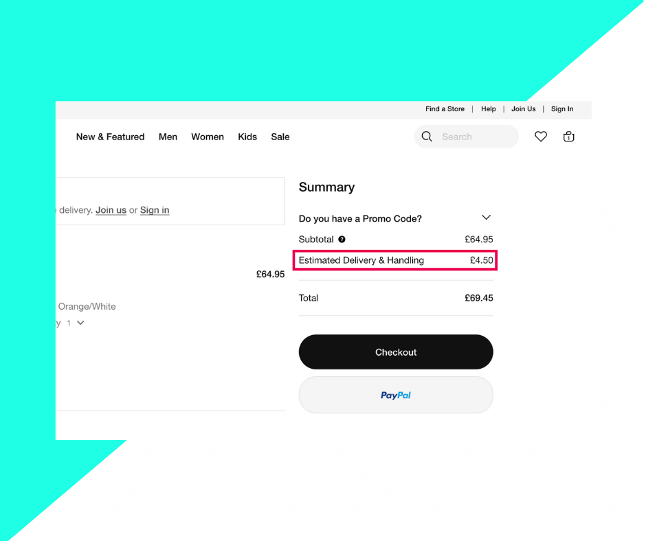
You can see how Nike has added this estimated here in the example.
Don’t hide the discount field
Sometimes brand checkout pages aren’t especially effective at displaying the discount or promo code field, which is a shame, because oftentimes customers have arrived on your website because of a special sale or event. Don’t make them go looking for this field. You want to display this above the fold, and ideally as close to the subtotal or total calculation as possible. This allows the customer to see how the discount has impacted the overall expenditure and the direct correlation is visually available to them.
We can look again at Nike. This shop cart page doesn’t have the field open at all times, but in drop down functionality. This is a nice touch, as it is unobtrusive if you don’t have a promo code (and there is no “empty” field at checkout), but still highly visible and obvious to those who will want to add a discount to their shopping cart. For a similar example, see IKEA’s page, which also features a drop down discount code option.
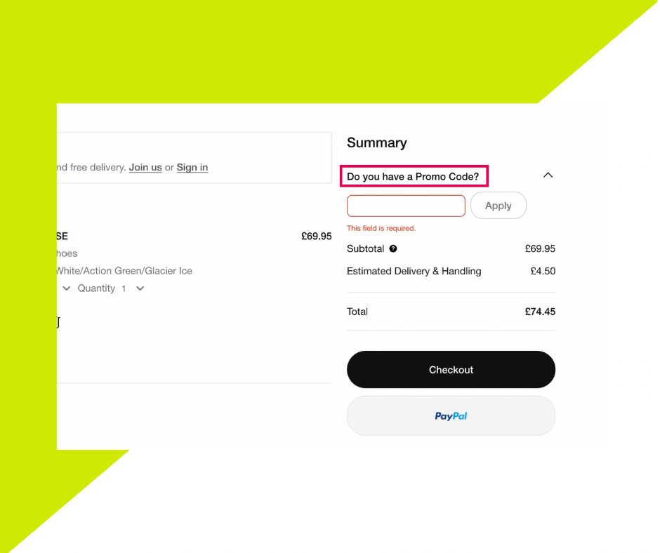
Alternatively, communicate with the customer that the promotion or discount can be added at the next step—checkout—and don’t leave them guessing, or you could lose them at this critical stage.
Have an image of the product and show the saving per line item
When it comes to reviewing the shop cart, your customer will want to see each of their products, not just read the product titles. Make sure to include a product image as prominently as the space allows, and make sure that it is high quality—no grainy little icons here, please. This will ideally save them from any accidental product additions, such as those with similar or unusual names—and saves you from facilitating a return.
When it comes to communicating savings, too, you may be tempted just to add it on at the end, as a general “discount”. However, it’s better to communicate fully with your customers that each of these savings is individual, and note them line by line in the product list. This allows the customer to understand exactly where their discount has come from, and confirm that they are, indeed, getting the saving advertised.
For example, our client The Radiator Shop showcases not just the product name and image at the cart page, but all the necessary details, including size and colour.
Have a continue shopping button to take them back to where they were
This is optional but works well for stores with larger product catalogues.
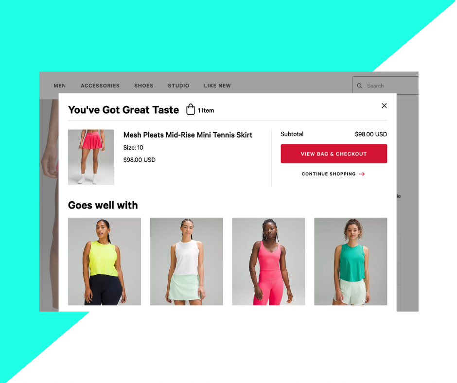
Basically, if you want your customers to add multiple items or create large order lists, you don’t want to direct them to the cart and checkout pages too quickly. Instead, you will want to give them the option to “continue shopping”. You can see how LuLuLemon (below) has created this handy pop-up for customers, where they tell their shoppers that they have great taste—a nice unique touch in the copy—and what their current subtotal is. It also gives them the option to head straight to their cart for review and checkout, or to continue shopping. Clicking Continue Shopping simply closes the pop-up and leaves the customer to continue shopping exactly where they left off.
Offer a final shopping suggestion
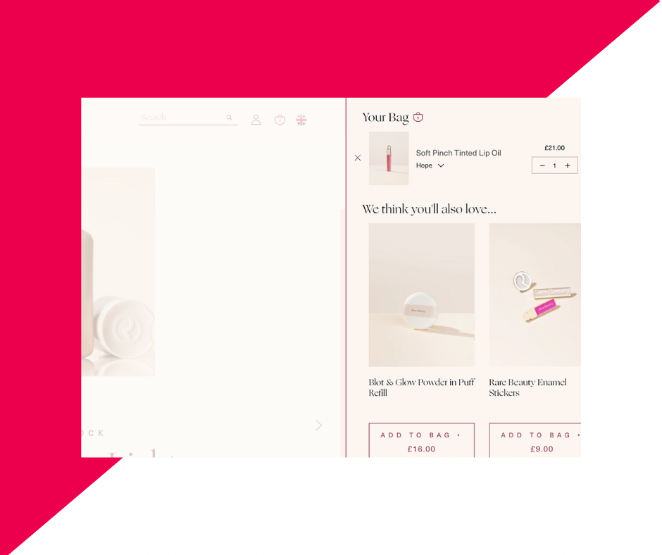
As your customer goes to checkout, you might want to take this opportunity to crosssell or upsell. For instance, look at how Rare Beauty suggests additional items to their user when viewing their cart—with simple “Add to Cart” buttons and the individual prices displayed prominently.
This is also a good place to make suggestions based on the product’s nature. Has your customer added a plant without a pot, or a pair of shoes with a bag? What about a tub of paint, but no paintbrush, roller, or masking tape? You can preempt your customer’s needs here at one of the last stages in order to better serve them and increase your own conversions, as well.
Conclusion
It’s important to get your cart right. It is, at its most basic, a bridge between the user’s shopping experience and the final purchase, but as we all know, bridges require careful thought and construction—it’s not all about the destination, so much as the experience in getting there.
With this in mind, be sure to create a simple and consistent cart page, which allows users to edit, remove and leave notes on their products, and also feel secure and confident in both the price they have spent and the experience they have received.
If you have additional queries about your cart page, or Shopify in general, please contact us. We’re happy to help.
If you are interested in further news and information about Shopify, consider signing up for our email newsletter, Shopify Insider.