734%
Increase in UK Orders
+43%
Returning Customer Rate
67.8%
Sell-Through Rate
- Sector: Food & Beverage
- Platform: Shopify
Overview
Two Stacks Whiskey’s name pays homage to a traditional method of whiskey production, where pot stills and column stills were frequently “stacked” together to craft various styles of whiskey.
When Two Stacks Whiskey approached us, they were seeking a complete website refresh to elevate their digital presence and enhance the overall customer experience. Our goal was to redesign the site to better reflect the brand’s story and values while improving usability, ensuring that both loyal customers and new visitors could seamlessly explore their range of products.
Strategy
Firstly, the team at Two Stacks Whiskey wanted to move away from their existing WordPress store and to Shopify, which would be more powerful, robust, and customisable. In particular, they wanted a website that would allow them to create product releases and drops with more ease, and highlight the quality and unique value of their product. We were also keen to create a website that was not only easy for users to navigate, but for the Two Stacks Whiskey team to use and update.
What We Did
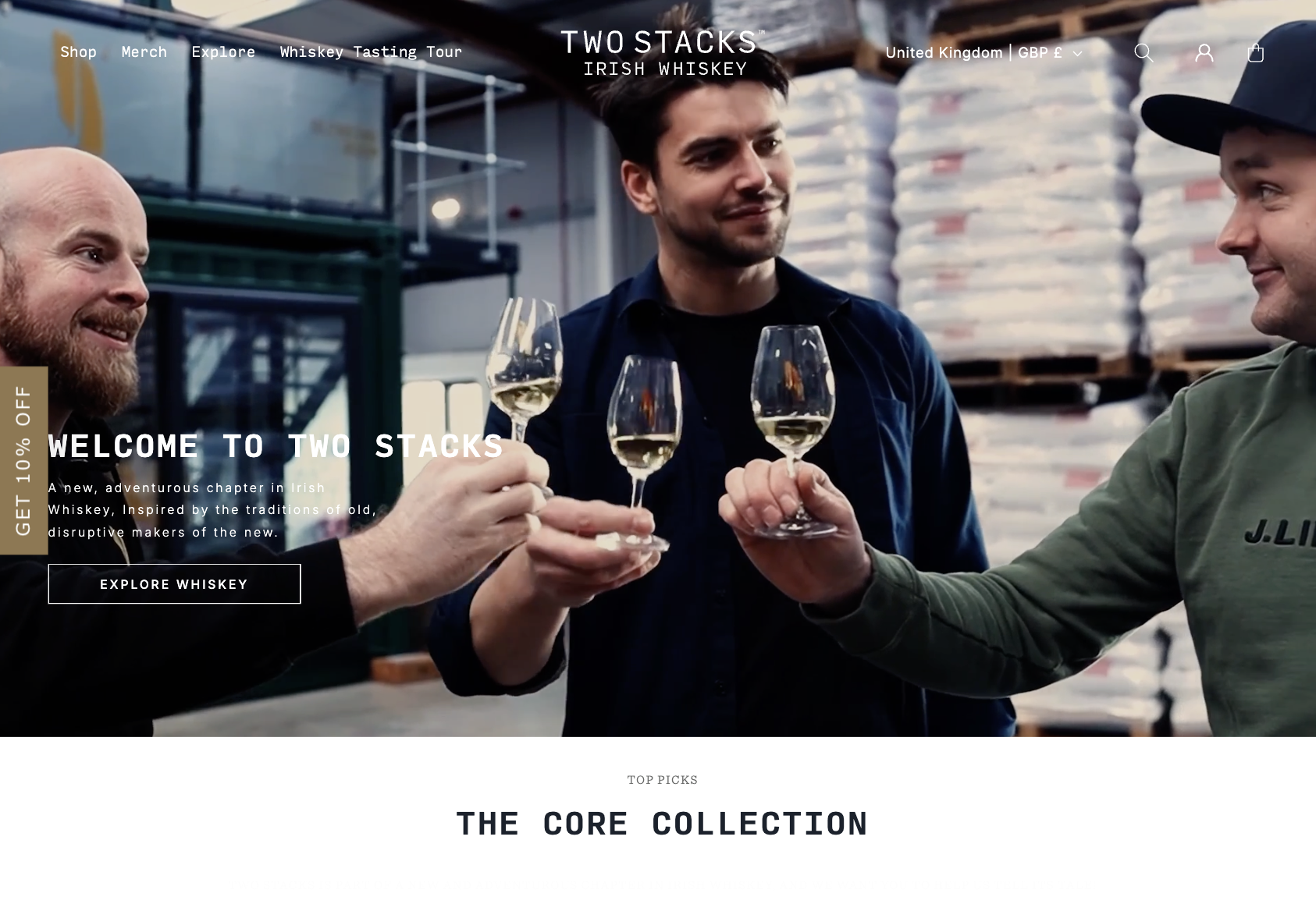
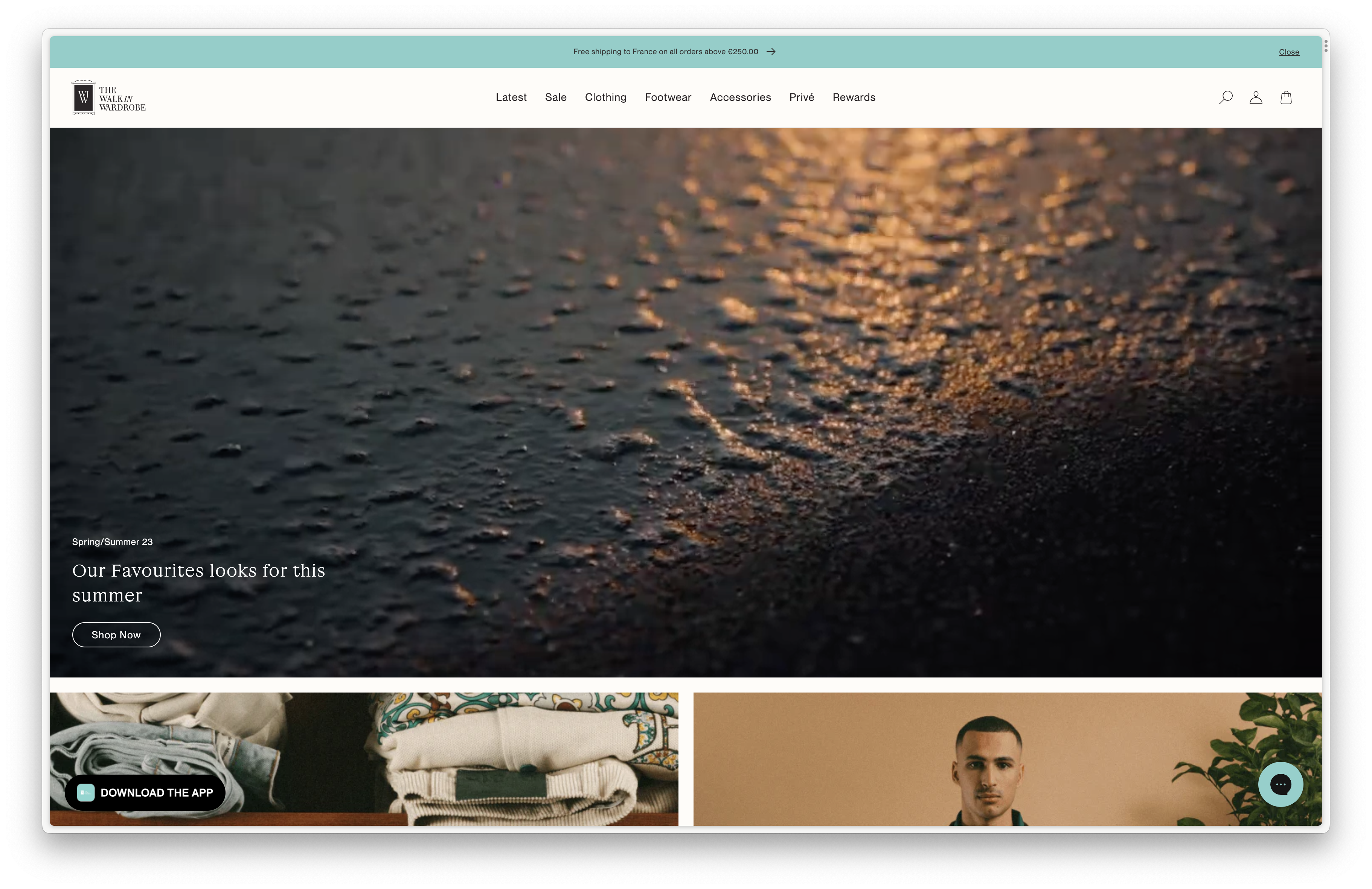
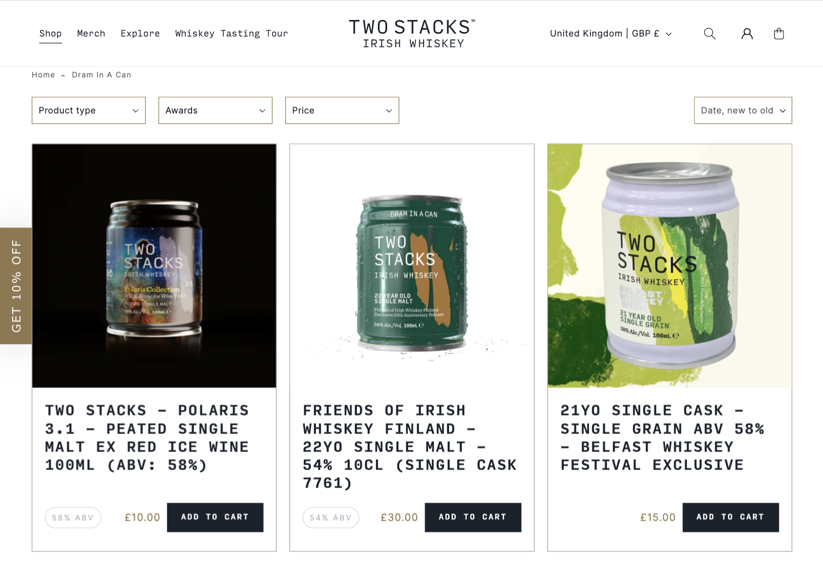
In creating the new Two Stacks Whiskey website, we integrated visually engaging elements like the video you see on the landing page to showcase the brand’s products and rich history. Other creative features include the dynamic product slider, which works seamlessly across both desktop and mobile, the introduction of more high quality photography, and the addition of product collections with unique header images to give each product category a more distinct identity.
On the technical side, we built the site to incorporate meta fields, such as low-stock alerts, to enhance the customer experience and drive urgency in purchases. To streamline the purchasing process, we added a slide-out cart, making it easy for users to review their selections and proceed to checkout without leaving the current page.
- Integrated a visually engaging landing page video
- Added a dynamic product slider compatible with desktop and mobile
- Introduced high-quality photography throughout the site
- Created distinct product collections with unique header images
- Built meta fields for features like low-stock alerts
- Implemented a slide-out cart for easy review and checkout
Results
Although the site is still very new, it has already gained significant traction.
Returning customer rates have increased to 43%, and the conversion rate is an impressive 3.05%, well above the beverage industry average of 2.3%. The average order value has risen by 13%, and the site now boasts a 67.8% sell-through rate and only 16 returns from 766 orders.
The implementation of multi-currency has driven a 734% increase in UK orders, and the bounce rate has decreased by 24%, now at 54.01%, and mobile sales now make up 35% of total online revenue, up by 25% from the previous year. Customer retention has also improved, rising from 25% to 35%.
